Every car has a logo. The logo embodies each manufacturer's mission statement or heritage.
Some logos have a pretty lame history while others have intriguing stories behind their creation.
Read on to know about different logos and the story behind each one . . .
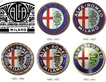
1. Alfa Romeo
Founded: 1910
Headquarters: Turin, Italy
The red cross celebrates the deeds of Giovanni Da Rio who is reputed to have been the first to climb the walls of Jerusalem and erect a cross there during the first crusade.
The other half of the symbol is occupied by a man-eating serpent that reportedly terrified the local populous of Milan in the early part of the 5th century AD.
. . .
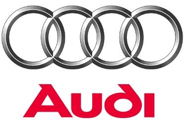
2. Audi
Founded: 1910
Headquarters: Ingolstadt, Germany
The Audi badge the 'Four Rings' is the emblem of one of the oldest car manufacturers in Germany.
It symbolises the 1932 merger of the four independent motor-vehicle manufacturers: Audi, DKW, Horch and Wanderer.
Together with the NSU brand, which joined in 1969, these companies are the roots of the present-day AUDI AG.
After the World War II, the Audi name -- which is Latin for 'Hear!' -- disappeared, but was revived in 1965, using the four rings as a logo.
Also, the name is sort of a pun on 'hoerch', German for 'hear', name of one of the founders.
The company itself is more than a century old.
The new logo, released in September 2009 changes the font and also improves on the 3-dimensional aspect of the rings.
. . .

3. BMW
Founded: 1916
Headquarters: Munich, Germany
BMW stands for Bayerische Motoren Werke or Bavarian Motor Company.
The company was established in 1913 and based in Munich, Germany.
It started out as an aero engine manufacturer, hence the company logo.
The logo comprised four quadrants of alternating white and blue colour.
It is a stylised representation of an airplane propeller spinning against the clear blue sky. The logo represents a white propeller blade against a blue sky.
It reflects the origins of BMW as a maker of military aircraft engines during World War I.
Also, white and blue are the traditional colors of Bavaria.
. . .
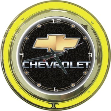
4. Chevrolet
Founded: 1911
Headquarters: Detroit, Michigan
Chevrolet first used its Bowtie emblem logo in 1913.
On November 3, 1911 a race car driver and automotive engineer Louis Chevrolet co-founded the Chevrolet Motor Car Company with William C Durant (ousted founder of General Motors) and investment partners William Little (maker of the Little automobile) and Dr Edwin R Campbell (son-in-law of Durant).
The logo is said to have been designed from wallpaper Durant once saw in a French hotel.
More recent research by historian Ken Kaufmann presents a compelling case that the logo is based upon a logo for coalettes.
Others claim that the design was a stylised Swiss cross, in honour of the homeland of Chevrolet's parents.
. . .

5. Ferrari
Founded: 1947
Headquarters: Maranello, Italy
The famous symbol of Ferrari is a black prancing horse on yellow background, usually with the letters S F for Scuderia Ferrari.
The horse was originally the symbol of Count Francesco Baracca, a legendary 'asso' (ace) of the Italian air force during World War I, who painted it on the side of his planes.
Baracca died very young on June 19, 1918, shot down after 34 victorious duels and many team victories.
Interestingly, German sports car manufacturer Porsche borrowed its prancing horse logo from the city's emblem.
. . .
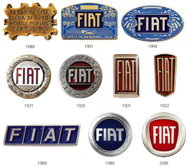
6. FIAT
Founded: 1899
Headquarters: Turin, Italy
The FIAT is an acronym for Fabbrica Italiana Automobili Torino (Italian car factory of Turin), founded by a group of investors.
The current Fiat logo has the letters F-I-A-T written with a silver line between each of them.
The lines were added by the company's design chief when one day passing under the factory, he noticed the sky at the backdrop of the huge FIAT letters on the top of the building.
The lines added are the spaces he saw in the company's name over the building and decided to keep it.
Fiat was founded in Turin on July 12, 1899.
The first plant, inaugurated in 1900 at Corso Dante, had 235 employees and produced 24 automobiles.
The first automobile to bear the Fiat brand name was a model 4 HP.
. . .
7. Ford
Founded: 1903
Headquarters: Dearborn, Michigan
The Ford oval trademark is one of the best-known corporate symbols in the world and has been in regular use for more than 50 years.
The script trademark dates back to the inception of the company when Henry Ford's engineering assistant developed a stylised version of the words 'Ford Motor Company'.
This last logo is the blue oval that Ford released in 2003 in honour of the 100 years of the company.
The logo was named the 'Centennial Blue Oval'.
. . .
8. Hyundai
Founded: 1967
Headquarters: Seoul, South Korea
The Hyundai Motor Company is a South Korean company manufacturing automobiles. Their automobiles are available in many countries around the globe.
The Hyundai logo appears to be an oval shaped H (symbolising Hyundai).
It is also supposed to be symbolic of the company's desire to expand. The ovaloid shape indicates the company's global expansion and the slanted, stylised 'H' is symbolic of two people (specifically the company and customer) shaking hands.
. . .
9. Jaguar
Founded: 1922
Headquarters: Coventry, England
The Jaguar logo is a Jaguar leaping across the company name.
The leaping Jaguart is possibly built to represent the speed, power and quickness of the car.
The Jaguar emblem is also placed on the front of the car.
Jaguar Cars Limited is a British based luxury car manufacturer, originally with headquarters in Browns Lane, Coventry, England but now at Whitley, Coventry.
It was founded as the Swallow Sidecar Company in 1922,by two motorcycle enthusiasts, William Lyons and William Walmsley, and changed its name to Jaguar in 1945.
. . .
10. Jeep
Founded: 1941
Headquarters: Toledo, Ohio, USA
The Jeep logo as it stands currently represents the front of the vehicle.
It consists of two circles representing the headlights and vertical bars representing the grill in the front of the car.
The word Jeep runs on top of the logo.
Jeep started out as a military vehicle and was later considered a Willys-Overland model, so it didn't originally have a logo.
Probably the closest thing to a Jeep logo appeared in 1963 in the centre of Wagoneer and Gladiator hubcaps and steering wheels.
The interesting thing about this logo is that never seen on the car itself.
The car just has the words 'Jeep' on it.
The logo is primarily used for advertising and marketing purposes.
. . .
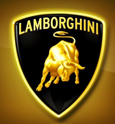
11. Lamborghini
Founded: 1963
Headquarters: Sant'Agata Bolognese, Italy
The Lamborghini logo stands for the founder's zodiac sign -- the Taurus (a bull). Ferruccio Lamborghini's love of bullfights is displayed in the logo and Lamborghini models get their names from famous bulls.
Lamborghini is now a subsidiary of German car manufacturer Audi AG, which is in turn a subsidiary of Volkswagen.
. . .
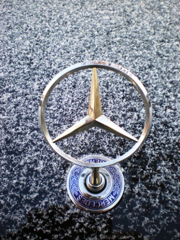
12. Mercedes-Benz
Founded: 1871
Headquarters: Stuttgart, Germany
The star in three corners represents the Mercedes-Benz dominance on land, sea and air. The star appeared for the first time in 1909 on a Daimler.
In 1926 the crown of laurel was added to mark the union with Benz.
The current logo with a star in a circle was used for the first time in 1937.
. . .
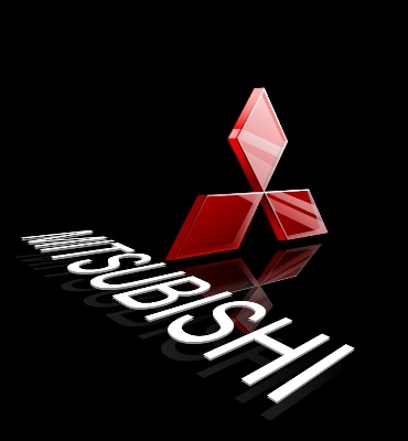
13. Mitsubishi
Founded: 1970
Headquarters: Tokyo, Japan
The three diamonds of the Mitsubishi logo represents the three ship fleet owned by the company founders and the first activity of the Nippon manufacturer.
. . .
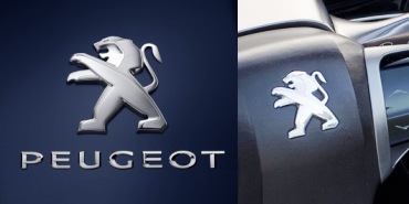
14. Peugot
Founded: 1882
Headquarters: Sochaux, France
The Peugot's lion logo was initially designed for marking saw blades and steel products.
It symbolises the three qualities of Peugeot saw blades: the toughness of the teeth, the flexibility of the blade, and the speed of the cut.
In 1850, the lion image appeared for the first time on the 'Peugeot Bros' arrow. Initially put on saw blades, this logo was registered in 1858, and for many years would mark the tools manufactured by the brand.
. . .
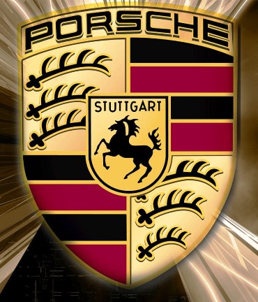
15. Porsche
Founded: 1931
Headquarters: Stuttgart, Germany
The Porsche logo is almost identical to Stuttgart's coat of arms. Stuttgart, was built on the site of a stud (horse) farm.
The antlers and red and black stripes are part of the arms of the Wruttemberg Kingdom.
. . .
16. Renault
Founded: 1899
Headquarters: Boulogne-Billancourt, France
The first Renault logo designed in 1900 features the initials of the three Renault brothers -- Louis, Ferdinand and Marcek drawn on a medallion.
In 1906, the company changed its logo to represent the front end of a car enclosed in a gear wheel.
In 1919, the company replaced its logo with the image of a tank.
In 1923, the company replaced its tank logo with the Grille-shaped logo and introduced the name of the car 'Renault' in its logo for the first time.
In 1925, the diamond replaced the circle and Renault became the 'diamond brand' and is called the same today.
In 1946, the brand was nationalised becoming Regie Nationale des Usines Renault.
This name is immediately added to the brand diamond, which is now Yellow.
The term 'Regie Nationale' was dropped in 1959.
In 1972, Renault modernised its logo.
The designer, Victor Vaserely redesigned the diamond in the shape of a dynamic 3-D diamond.
In 1992, the logo is enlarged and produced in relief, as part of Renualt's drive for progress, quality and innovation.
In 2004, Renault presents a new interpretation of its logo, placed on a warm yellow background.
In 2007, Renault begins a wave of 26 vehicle launches.
The logo is currounded by a yellow square -- a symbol of quality.
. . .
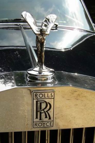
17. Rolls Royce
Founded: 1906
Headquarters: Buckingham Gate, London
The Rolls Royce logo consisting of the two 'R's or the double R clearly stands for the Rolls and Royce, two founders of this car manufacturing company.
In 1884 Frederick Henry Royce started an electrical and mechanical business. He made his first car, a 'Royce', in his Manchester factory in 1904.
He was introduced to Charles Stewart Rolls in a Manchester hotel on the May 4 that year, and the pair agreed a deal where Royce would manufacture cars, to be sold exclusively by Rolls.
A clause was added to the contract, stipulating the cars would be called 'Rolls-Royce'.
. . .
18. Skoda Logo
Founded: 1895
Mlada Boleslav, Czech Republic
Although the Skoda logo is viewed as one of the most original and stylistically clean manufacturing company trademarks in the world, the author is not yet known.
The black and green logo, which has been used since 1994, gives the Skoda brand a greater degree of originality -- black symbolises the hundred-year tradition, green signalises environmental production.
. . .
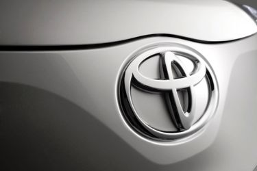
19. Toyota
Founded: 1937
Headquarters: Tokyo, Japan
Though the logo for Toyota looks like a T, it is actually three elipses depicting the heart of the customer, the heart of the product, and the ever-expanding technological advancements and boundless opportunities that lie ahead.
This symbol also represented Mars, the God of War, and also the symbol for 'man'.
The Volvo car and brand was sold to Ford in 1999.
The current Toyota Mark consists of three ovals: the two perpendicular center ovals represent a relationship of mutual trust between the customer and Toyota.
These ovals combine to symbolise the letter 'T' for Toyota.
The space in the background implies a global expansion of Toyota's technology and unlimited potential for the future.
. . .

20. Volvo
Founded: 1927
Headquarters: Gothenburg, Sweden
The logo for Volvo is the ancient symbol of Iron, which is a circle with an arrow pointed diagonally upwards to the right.
The name Volvo means 'I roll' in Latin and is derived from the Latin word "volvere" which means 'to roll'.
The name originated from the company that manufactured bearings for the car industry.