 | « Back to article | Print this article |
The story of the Delhi assembly election was the Aam Aadmi Party’s stunning debut. Rediff.com’s data experts, using Bayesian Networks, have mined terrific insights from how the nation’s capital voted in the recent assembly elections.
Our modelling shows pockets support for the AAP among the Internet savvy, TV viewers, white collar workers and educated voters.
We present the findings:
The results of the Delhi assembly elections have taken the nation by surprise.
The complete reversal of fortunes for the Congress party and the big gains made by the Bharatiya Janata Party and the Aam Aadmi Party once again proved that 'nothing is impossible' in Indian politics.
How did the AAP, in its first election, get such a large mandate?
What did the BJP do to succeed?
Where did the Congress go wrong?
These questions have been on everyone's mind since the results came out on December 8.
We bring to you yet another interesting application of Bayesian Networks.
This time, we built a mathematical model around the Delhi Elections 2013 to try and give you possible insights into what may have happened.

We used Rediff's proprietary data for constituency-wise break-up of age, educational qualifications, TV viewership, Internet usage, English proficiency and job profiles.
The graphical model that you see above was built by Rediff data experts using probabilistic estimates from this data.
Each node represents one variable from this data and each arrow points to the direction of what causes what.
For example, the node which is right at the top and labelled ‘graduate’, indicates that the probability that ‘many’ (we will define this shortly) graduates exist in a Delhi assembly constituency is 64.28%.
The arrow pointing from the graduates node says that higher the number of graduates in a constituency, the more likely that there will be English language proficient people in that constituency, the more there will be white collar workers and the more there will be Internet users.
What we seek to explain is what variables favoured a particular party in the 2013 election. This can be quantitatively seen in the variable ‘PartySupport2013.’
As you can see from the chart above, we have chosen to explain this from variables such as the age distribution of voters, their television and Internet usage behaviour, the extent of their English proficiency and the extent of white collar workers in that constituency.
Since we are trying to model a real world scenario, there may be variables that we may have missed out for various reasons (the main one being unavailability of data about that variable).
We then classified these variables into easy-to-understand categories using plots and other mathematical functions like their means and standard deviations as described below:
Age: Classified into two categories ‘Mostly20to39’ and ‘Mostly40andAbove’.
If the percentage of 20 to 39 age groups was more than 60% in a constituency it was classified as ‘Mostly20to39’, otherwise ‘Mostly40andAbove’.
Graduate: Classified into two categories ‘Few’ and ‘Many’.
If the percentage of graduates + college students was more than 25% in a constituency we classified it as ‘Many’, otherwise we classified it as ‘Few’.
White Collar Workers: Classified into two categories ‘Few’ and ‘Many’.
If the total percentage of white collar (clerks + businesspeople + shop owners + executives + managers + entrepreneurs) in a constituency was greater than 23% we classified it as ‘Many’, otherwise we classified it as ‘Few’.
English Literate: Classified as ‘Few’ and ‘Many’.
If the percentage of people who could write English in a constituency was greater than 50% we classified it as ‘Many’, otherwise we classified it as ‘Few’.
TV Viewers: Classified as ‘Few’ and ‘Many’.
If the percentage of people who viewed television (Doordarshan, Satellite or Cable) in a typical week in a constituency was greater than 80% we classified it as ‘Many’, otherwise we classified it as ‘Few’.
Internet Users: Classified into ‘Few’ and ‘Many’.
If the percentage of people that used the Internet in a typical month in a constituency was more than 15% it was classified as ‘Many’, otherwise it was classified as ‘Few’.
Party Support 2013: No classification was done except some minor parties were classified as ‘Others’.
As a first example, let us see how a high proportion of Internet users in a constituency affected the election outcome.
As shown in the chart below, we select the ‘Few’ option in the node for Internet Users.
The node turns red in colour and the probabilities in the Party Support 2013 node changes.
For example, the party support for the AAP comes down from 40.56% to 31.02%; the BJP party support goes up from 42.65% to 46.47%, but note how the Congress party support jumps from 11.69% to 16.69%.

Conversely, when we choose the ‘Many’ option in the Internet Users node (as shown in the chart below), the AAP party support jumps to 46.54% but the BJP and Congress share decline.
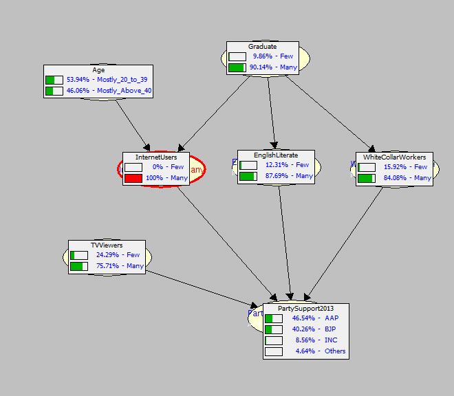
This is a clear indication that in the 2013 Delhi assembly election, Internet savvy voters flocked en masse to the AAP.
The BJP had an almost equal effect on Internet savvy and non-Internet savvy voters.
The Congress does not seem to have Internet savvy voters among its supporters.
This probably means that the Congress did not sufficiently explain itself on Social Media as much as the BJP and AAP did.
This is in agreement with the results that we found in our Twitter analysis.
How did educated voters in Delhi vote in 2013?
We get a sense of this when we choose the ‘Few’ option in the Graduates node in the graph below.
The AAP share declines to 25.86%; the BJP share rises to 50.33% while the Congress share jumps up to 17.41%.

On the other hand when we chose the ‘Many’ option in the Graduates node, the AAP share jumps up to 48.74% while the BJP and Congress share plummets as shown in the chart below.

This provides clear evidence that a majority of graduates voted overwhelmingly for the AAP.
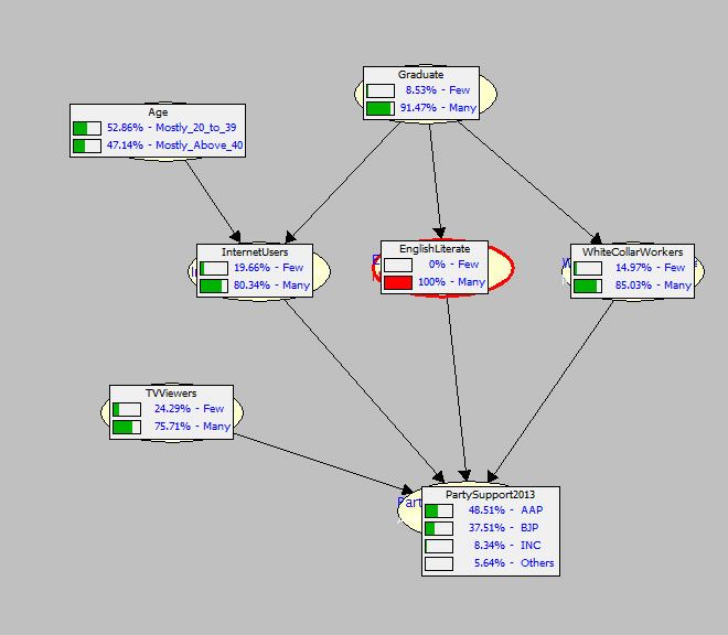
How did voters with a proficiency in English vote?
We can check this by choosing, first the ‘Few’ option in the English Literate node.
The AAP share declines to 24.34% as shown below, while the BJP and Congress support shares increase.

We next choose the ‘Many’ option in the English Literate node and see the jump upwards in the AAP’s support.
Clearly, English-proficient voters voted en masse for the AAP.
Which way did Delhi’s white collar workers’s votes go?
The chart below shows that when we chose ‘Few’ in the White Collar Workers node, the AAP share declines sharply to 17.62% but the BJP and Congress rise with the BJP sky rocketing to 56.05%

When we chose the ‘Many’ option (in the chart below) in the White Collar node, the AAP support share rockets to 52.54% while the BJP and Congress go down.

Clearly, the AAP was the party of choice for Delhi’s white collar workers.
The BJP also had a considerable influence on white collar voters, but had a much stronger influence on voters with blue collar jobs.
The Congress had a very small effect on voters with white collar jobs and had a better effect on voters with blue collar jobs.
Even in the constituencies of ‘Few’ white collar jobs, the BJP had a predominant effect as compared to the Congress.
How did intensity of TV watching affect voter choice?
When we chose the ‘Few’ option (chart below) the AAP’s support share goes down slightly to 34.59%, while the Congress share goes up slightly to 14.64%. The BJP remains almost constant.

When we chose the ‘Many’ option (chart below) the AAP’s support goes up slightly while the Congress support comes down slightly.
This suggests that Television did not affect the voting outcome one way or the other.

Did voters of a younger age flock to any particular party?


The two charts above lead to a counter-intuitive conclusion.
That voter age did not affect the outcome one way or the other.
There is almost no change in party support in 2013 for any party in the above two charts when we choose either of the two age options.
So far in our analysis we selected individual variables and studied the effect of each on the ultimate Party Support for 2013.
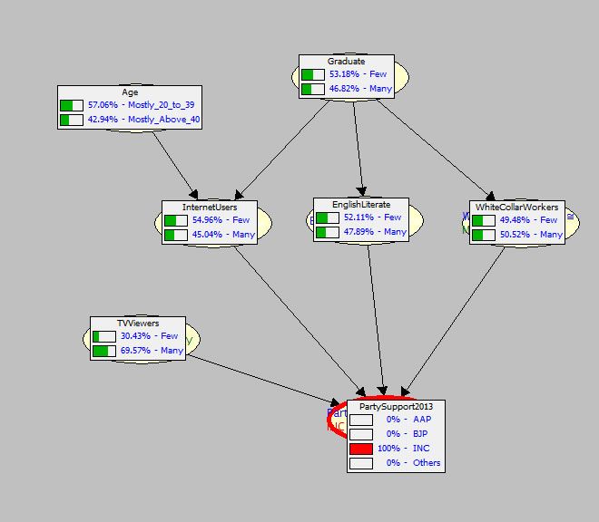
There is another type of Inference that a Bayesian Graphical Network is capable of doing which is called Evidential Inference.
In this we select a particular party in the Party Support 2013 node and see which variable played a part in that party’s seat outcome.
For example, if we select the AAP, as in the graph below, we can see that the presence of voters who are Graduates with high English Literacy, holding white collar jobs and who use the Internet extensively favours the AAP.

On the other hand when we choose the Congress option, as in the graph below, there is a shift away from this type of voter.
When we select the BJP (in the chart below) and conduct the same analysis we find that the distributions over ‘Few’ and ‘Many’ in English Literacy, White Collar Jobs, Internet Users and Graduates tend to become equal indicating that the BJP reached out to almost all the voters in Delhi.
Although the AAP had an edge in constituencies with voters who are graduates, were Internet savvy and held white collar jobs, the BJP was not far behind.
This probably explains why the BJP marginally scored over the AAP.

Credits: Constituency-level demographic information is from Rediff's proprietary data: the Graphical Bayesian Model used is thanks to Adnan Darwiche and his team at the Automatic Reasoning Group at UCLA.