 | « Back to article | Print this article |
Aiming to target the youth and emerge out of the shadow of its 'kids' drink' legacy, it has changed it looks and taste
 Fond, childhood memory, but nary a current one -- this is what Frooti's parent, Parle Agro, wants to change about it.
The mango drink has been given a radically different avatar, as a result.
On the cards is a 50 per cent increase in sales by dint of the new packaging alone.
Nadia Chauhan, joint managing director and chief marketing officer, says, "The whole story starts from the fact that while Frooti is an integral part of everyone's childhood memories, very few have a current one of drinking Frooti."
Since its launch in 1985, Frooti has been steeped in cues that have been instant hits with kids, forming both its legacy and its challenge.
When launched, kids found its square pouch, under the trademark of Tetrapak, a breeze to use compared to the glass bottles or plastic pouches available then.
It was also a time when multinational players like Coca-Cola and PepsiCo, with deep pockets for marketing and scale, were missing from action.
But Frooti can no longer afford to remain a kids brand.
The soft drinks market became young adults-led from the 2000s onwards.
Frooti found it difficult to rid itself of its mostly-for-kids connotation over the years, despite the fruit soft drink market growing in leaps and bounds, compared to carbonated soft drinks, which seem to be falling out of favour.
Chauhan says, "We are rewriting brand Frooti, right from its pack, look, advertising to the product formulation. We are writing the brand's strategy for the next five years."
Alok Nanda, founder and MD, Alok Nanda & Company, which has a repertoire of packaging and brand identity design work for some well-known brands, says, "It has done the right thing by going in for such a change as it was becoming dated.
"How much baggage a brand leaves behind will get decided by the degree of disconnect with the current consumer and the degree of opportunity in repositioning."
For Frooti, which has gone for a new font, pack, even taste, and soon, advertising, it had to be a break away from its past. The only connect it has retained is the colour of the pack.
"We went with foreign agencies because we wanted someone without a history of Frooti and notions about restricting the brand to a certain band of consumers.
"A marginal change won't do the job," says Chauhan.
The task at hand is to rope in the youth.
"From its early days, Frooti was designed for kids.
"So, it ended up losing out the larger audience of young adults.
"It has been playing on our minds for a long period, especially since we entered with plastic bottles that are now a large part of the market," says Chauhan.
Even though Parle Agro was the first to introduce a fruit drink in a plastic bottle (early 2000s), which requires a reinforced bottle because hot liquid is poured in it, unlike fizzy drinks, it was blindsided by the success of plastic bottles.
"We wanted to test whether the larger bottles sold well or not, so we did not invest heavily.
"But others soon followed with the requisite firepower, while we took time to ramp up. So, we faced a lot of competition in the format favoured by the youth."
Plastic bottles contribute almost 50 per cent to the category, according to industry estimates.
While London-based
Pentagram has designed the new Frooti, New York-based Sagmeister & Walsh worked on the campaign, which will break with outdoor and TVCs this month.
Pentagram was told to change everything but the name while Sagmeister & Walsh had to reinforce the new identity with a theme Frooti had not tried before.
Frooti had parted ways with its Indian ad agency, Creativeland Asia, which is headed by Chauhan's husband, Sajan Raj Kurup.
Two of Pentagram's partners (graphic design and engineering) travelled to Indian cities, taking photos.
Graphic designer and partner, Pentagram, Harry Pearce, says, "The photos created a visual narrative of typographic nuances and idiosyncrasies particular to Frooti.
"The new identity is inspired by the journey of the Totapuri mango, with the new logotype taken from the stencil style lettering used in the crates that deliver the mangoes, spotted in Mumbai's Crawford Market.
"We had to be sensitive to Frooti's beloved status but be radical to appeal to new consumers amongst the 15-30-year-olds who are currently in the minority.
"Often stacked on top of each other, the packs had to be striking when viewed in multiples."
Chauhan says, "There is a clear business objective to get a 50 per cent growth in sales purely as an outcome of package design, even before advertising starts.
"We saw with Appy Fizz, that even with zero advertising, packaging change can make a huge difference."
For the mainstream campaign, Jessica Walsh, partner at Sagmeister & Walsh and creative director of the campaign, says, "The goal was to introduce the new packaging in a fresh, bold, and playful way.
"We chose to do stop motion style animation for the TVC, which is an extremely time-consuming process.
"Every two-second clip took hours to create.
"It had to be different from what Frooti had done before and what its competition does now.
"We created a miniature world using tiny-scaled models of vehicles, people and plant life.
"Only the Frooti packaging and mangoes were kept in real-life scale to let them be the hero of the shots while allowing us to tell stories, humourously."
The ad will have music collaboration by the composer Amit Trivedi and lyricist Amitabh Bhattacharya.
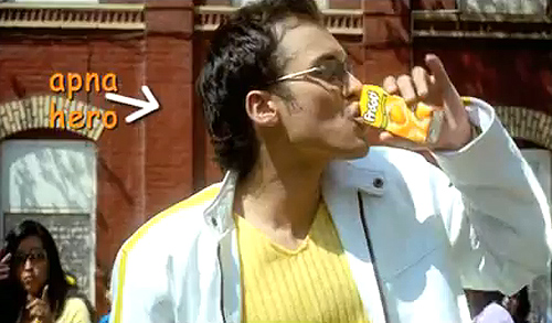
Brand ambassador Shah Rukh Khan will continue to be a part of the campaign, albeit in a different way than previous ads.
Games and other digital media strategies will also be rolled out by Sagmeister & Walsh in the next few months.
While the distribution of the different packs would be over in the next couple of days, Chauhan claims that since the mid-January roll-out, Frooti has seen increased visibility "and we are not even in the midst of the main season nor is our mainstream campaign out, yet", neither have trade discounts kicked in yet, she says.
Chauhan says that in the last 11 years since she started working on the brand, brainstorming sessions on Frooti's annual plans would always hit a mental block when it came to what Frooti could associate with.
"Now Frooti has become relevant for college events as much as for erstwhile school events, it can associate with trendy TV programmes, music festivals and multiplexes, as well as corporate offices where young adults are to be found."
From asking ‘Why grow up’ (which was one of its intermediate slogans), Frooti now wants to grow up and fast.
FROOTI FACTS