 | « Back to article | Print this article |
PIX: 11 brands that went for a makeover to succeed
Brands are known for their identity, personality and design. It takes years of hard work and trust to build a successful brand image. So why do marketers go in for a change after they have successfully established the brand?
Marketers and brand managers say the reason could vary from brand to brand, but most common imperatives for a brand makeover are:
- To be more youthful
- To compete with global brands
- To upgrade the brand
- To expand brand portfolio
- In case of a merger or acquisition
Whatever may be the reason, the bottomline is that it's all about the chase for the consumer's wallet and to reach out to younger customers who have more money to spend than ever before.
But this is not an easy task. Even for an established brand, launching a new brand identity is a challenging and time-consuming task. The brand custodian has to carefully chart out its moves.
Here is a look at some of the recent brand makeovers. Let us know, if you think whether these companies have been successful in their attempt or not.
Click NEXT to read more...
Why do established brands go in for a makeover
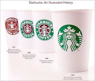
Starbucks
Earlier this year, the global brand went in for a makeover. Here, the Seattle-based coffee chain dropped the words 'Starbucks Coffee' and brought the Siren out of the circle.
Commemorating its 40th anniversary this year, company leaders said the logo change marks the company's milestone year and Starbucks' next chapter.
However, industry points out when Starbucks stock began dropping in 2007, the company realised, that it was time to change.
Also, last year, Starbucks announced it would renovate its thousands of company-owned stores, in 52 countries, to be more sustainable and to look, well, less global and more local.
This is the fourth version of Starbucks' logo since the company's beginnings as a small coffee, tea and spice shop in Seattle in 1971.
Click NEXT to read more...
Why do established brands go in for a makeover

Zee TV
Along with the new logo, Zee TV launched also launched its new brand positioning 'Umeed Se Saje Zindagi'.
With the new bight blue logo and identity, Zee aims to take forward a progressive outlook. However, the industry cites the reason as: When brands get old and lose their connection with the audiences, a makeover helps them get a fresh lease of life.
But, Zee sticks by its explanation. Punit Goenka, ZEE MD & CEO said, "We believe the time is right to infuse renewed freshness into the brand and reflect an identity that truly articulates our spirit."
To successfully be able to reach its goal, Zee has redesigned the "Z" in a stylishly new font and is presented in aqua blue colour.Click NEXT to read more...
Why do established brands go in for a makeover

Star Plus
Likewise, Star Plus went in for an image change last year. The reason behind the change was that Star Plus was trying to regain its numerouno position, which it had lost to Viacom 18's Colors.
Numbers suggest that the re-launch has put Star Plus back in the game. The channel claims that on an annual basis they are 35-40 per cent ahead of any other channel in the Hindi GEC space.
Again striking the emotional chord with -- 'Rishta wahi, soch nayi', Star Plus launched its ruby colour star. Thus, bidding goodbye to its blue star.
Click NEXT to read more...
Why do established brands go in for a makeover

Airtel
In an attempt to connect with the youth and synergise its global operations, last year Airtel launched its new logo complete with new designs and fonts.
Besides the logo, the company has also changed the signature Airtel tune with a new one by music composer A R Rehman.
Maintaining the colour red, the brand added a sort of swoosh locked with the word Airtel. However, the capital 'A' made way for the small 'a' giving it a more youthful look.
It is estimated that Airtel spent over Rs 300 crore (Rs 3 billion) on the re-branding exercise.
Click NEXT to read on . . .
Why do established brands go in for a makeover
Wipro
Wipro went in for a makeover in an attempt to connect with its customers on an emotional level. However, Wipro changed its logo several years ago.
The logo created then - a combo of a rainbow flower, the nameplate Wipro (in black) and the tagline "Applying Thought (again in black) - has served the company well all these years.
However, given Wipro's growing global footprint across diverse businesses, it is understood that the $6-billion company may once again go in for brand makeover.
The colours in Wipro's sunflower represents:
Red: Blood, Life giving, Dynamic, Auspicious
Green: Fields, Prosperity, Freshness, Growth, Youth
Yellow: Sun, Warmth, Vitality, Aspirations
Violet: Intelligence, Innovation, Shrewdness, Mystery
Blue: Sky, Sea, Transparency, Natural
Click NEXT to read on . . .
Why do established brands go in for a makeover
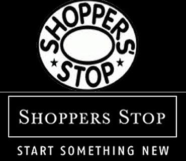
Shoppers Stop
To sync in with its identity of a luxury store, Shoppers Stop launched its new logo and the tagline Start something new.
The other reason for the changed identity was to connect with the youth. Thus, along with the logo change it introduced services like exclusive Shopper's Stop radio and so on.
However, it continued to maintain its black and white theme, which the company believes that it helps the brand to break the clutter.
But, the real reason behind the colours was fax error. That's right. But, it did seem to have worked well for the brand, and now the company continues to retain its colour error.
Click NEXT to read more...
Why do established brands go in for a makeover

Ceat Tyres
The good ol' Rhino paved way for Ceat new logo. And, with the Rhino the company also bid goodbye to its tag line: Born Tough.
The new logo was a result of extensive feedback received from Ceat employees, customers and partners. Its inspiration emerges from the idea of 'raising the bar'.
The lines in bright orange gives the logo a youthful and contemporary look and combined well with the maturity and stability of the blue letter signifies Ceat's rich heritage in the sector.
The idea behind the change was to connect with it young customer base.
Click NEXT to read more...
Why do established brands go in for a makeover
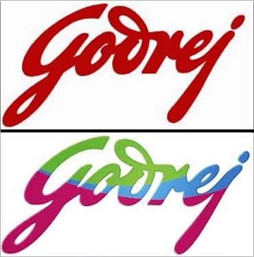
Godrej
About three years ago, the 112-year-old Godrej brand went in for a makeover.
The signature, which was red in colour for the longest time, was changed to maroon, green and blue. These new colours represent energy, innovation and growth, respectively.
The idea was to make the brand contemporary and relevant to it customers. For this, the company spent over over $1 million (Rs 4 crore).
Click NEXT to read more...
Why do established brands go in for a makeover
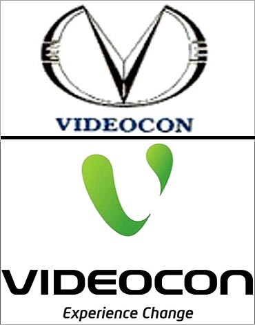
Videocon
Videocon Group's new eco-friendly green brand identity was well marked by its tagline - Experience Change.
Prior to this, the brand has banked on other propositions, such as 'Technology for health and pleasure', 'Bring Home the Leader', 'New Improved Life', 'The Indian Multinational', 'Whatever role life gives you, play it big', as well as the most recent one, 'Eco Logic for sustainable life'.
The 'V' in the new Videocon logo is composed of two animated green, lava-like shapes called Chouw and Mouw.
Both have certain personality traits, based on their physical attributes. The bigger one, Chouw, is slow but earnest; strong and silent; he is patient, good natured, kind, and maybe a little romantic too. The smaller one, Mouw, is quick witted, energetic bordering on restless, curious, and funny.
Click NEXT to read more...
Why do established brands go in for a makeover

Dabur
Dabur's logo change was an attempt to be recognised as young, contemporary brand.
In the new logo, Dabur replaced its age old brand identity of a banyan tree with a new younger, colourful and vibrant tree with the tagline "Celebrate Life".
By transforming the logo Dabur wanted to modernise the 100-year old equity of the Dabur brand. As part of the new look, the fonts were also changed.
However, the new Dabur identity retained the enduring and valuable attributes and the essence of banyan tree.
The Dabur fonts were created as an echo of the earlier font to preserve its distinctive and established identity. Yet, it has been made contemporary in style. The defined yet gentle curve of D forms an arc of trust, caring and support.
Click NEXT to read more...
Why do established brands go in for a makeover
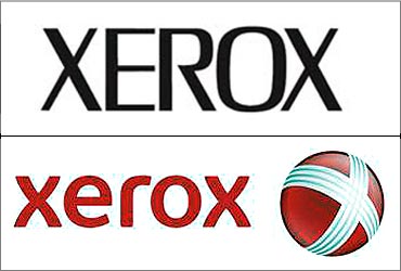
Xerox
Xerox's new logo was intended to change its old image as a photocopier manufacturer and highlight its software, colour printers and other technologically updated products.
The all-capitalised corporate name in red, which has been in service in different versions for 14 years, was replaced with a lowercase version. It also sports a red sphere marked by a white "X" laced with silver stripes.
However, the company decided to retain the color red, because among their major markets is East Asia red stands for good will, luck and success.